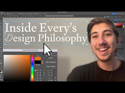
The Future of Design Is Art Direction, Not Pixel Pushing -…
Episode 55 features Lucas Crespo, creative lead at Every, on how AI image generation is shifting design work from pixel-level execution toward art direction and curation. Topics include Every's visual identity, which blends classical motifs (Greek statues, Baroque symbols) with saturated modern colors; why art direction matters more as AI makes generating images easier; reimagining websites to prioritize serendipity and curiosity over speed and control; the design language behind Cora's landing page and launch video, built around turning the inbox into a calm, thoughtful experience; the argument that minimalism is overrated; Lucas's Midjourney workflow for creating cover images, including a walkthrough of Every's consulting page image (a human and robotic hand fist-bumping); how Midjourney compares with ChatGPT's native image generation; and how AI is rewriting the designer's role toward interfaces curated with the intention of a film set or ad campaign.
# Channel Presentation Observations — "The Future of Design Is Art Direction, Not Pixel Pushing - Ep. 55 with Lucas Crespo"
## Video Format
- **Interview/conversation podcast with screen sharing.** The host (Dan Shipper) interviews Lucas Crespo, Every's creative lead, in an episodic format: "Ep. 55." Evidence: "Lucas, welcome to the show... Thank you for having me."
- The format includes live demonstration segments: "show me share your screen... Let me share my screen" — the guest walks through Midjourney prompts, Photoshop workflows, Every's website, and the Kora product.
- Episodes feature **behind-the-scenes content from the host's own company**: "let everyone see a little bit of a behind the scenes on how you work."
## Host & Guests
- Host identifies himself indirectly as **Dan Shipper**, referenced in the outro: "a journey into the future with Dan Shipper as the captain of the spaceship."
- Guests are **colleagues/company team members with topical expertise**: Lucas Crespo is introduced as "the creative lead at every, which means that you're responsible for the vibe basically of every and all of our products."
## Claimed Scope
- The channel is tied to **Every, a media/newsletter company**, and discusses **AI's impact on work and creative careers**. Evidence: "the fact that like AI is baked in into everything that we do write about or even talk about in all of our meetings."
- Scope explicitly includes AI tools and design: the episode covers ChatGPT image generation, Midjourney, Photoshop AI tools, and design aesthetics ("maximalism," "neoclassical pop art," art direction vs. pixel pushing).
## Intended Audience
- **People interested in AI tools and creative/design work**, including designers concerned about AI displacement: "if you're a designer and you noticed that and you get scared because... you can just now generate UIs..."
- **Existing Every audience members**: "if they're already familiar with every then like one of the reasons they might be excited to listen to this episode is because they're just like I love every's aesthetic."
- Audience is addressed as both **listeners and viewers** (audio + video): repeated phrases like "for people who are listening and not and not watching."
## Observable Presentation Patterns
- **Conversational, informal tone** between host and guest who know each other well: "I just love hanging out with you."
- **Career-transformation-through-AI narratives** are a demonstrated theme: the host recounts how ChatGPT, DALL-E, and Midjourney "completely changed... the trajectory of your career."
- **Practical tool walkthroughs** with specific prompt examples quoted verbatim: "black and white vintage Greco Roman sculpture of two hands shaking in a white studio background."
- Episodes reference **future guests and the company's portfolio** (e.g., Kora, "we'll have Quinton who's the founder, will be on the show in a couple weeks"), indicating an ongoing series with cross-promotion of company products.
## Self-Description Evidence
- The outro (apparently scripted/comedic) self-describes the show as: "this show is the epitome of awesomeness... pure unadulterated knowledge bombs about chat GPT... It's not just a show, it's a journey into the future."
- The show name appears to be **"AI and I"**, per the outro call-to-action: "smash that like button and subscribe to AI and I."
## Distinguishing Claims from Demonstration
- **Creator claims**: The outro's promotional framing ("epitome of awesomeness," "treasure chest") is self-promotional hyperbole, not demonstrated content evidence.
- **Demonstrated**: Deep, first-hand practitioner knowledge of AI image tools, a collegial host-guest dynamic, and integration with Every's own media products and design work are directly evidenced by the transcript content itself.
# Delivery Observation: Ep. 55 with Lucas Crespo
## Overall Format
- **Two-person conversational interview** with host Dan Shipper and guest Lucas Crespo, opening with a cold-open montage of guest soundbites before the formal welcome.
- Mid-episode shifts to a **screen-share walkthrough** format, with the host repeatedly narrating visuals for audio-only listeners: *"for people who are listening and not watching, basically what mainframe has is..."*
- Ends with a sudden, tonally jarring **automated-sounding outro** ("*smash that like button and subscribe*"), which contrasts sharply with the low-key interview tone before it.
## Tone
- **Warm and affectionate throughout** from the host, especially during the introduction: *"cuz I just love hanging out with you"* and *"you're kind of like the ideal you're a founder's best friend."*
- Guest matches with a **relaxed, casual register**, heavy on filler words: *"Yeah. I mean I I think like uh for me it's been a a good journey so far."*
## Vocabulary & Recurring Phrases
The guest's most repeated lexical choices:
- **"Vibe"** — used constantly as a design term: *"you're responsible for the vibe basically,"* *"we start first with like vibe and then the vibe slowly becomes the rectangles."*
- **"Like"** as an all-purpose filler — appears in nearly every guest sentence.
- **"You know"** — sentence-ending tag used dozens of times: *"we needed to to pop, you know."*
- **"Sort of like" / "kind of like"** — hedging connectors: *"it's sort of like digital architecture, right?"*
- **"Things like that"** — list-terminator habit: *"columns, architecture like statues and like stuff like... like statues and things like that."*
## Teaching / Explanation Habits
- **Concrete example-driven teaching**: When asked about AI aesthetics, the guest walks through a specific website (Mainframe) rather than abstracting: *"I've spent like a lot of time in it just trying to figure out how they did some of the things."*
- **Process transparency**: The guest shares raw Midjourney prompts verbatim: *"black and white vintage Greco Roman sculpture of two hands shaking in a white studio background."*
- **Why-questions welcomed**: When the host asks *"Why white background and why black and white?"* the guest gives a practical, tool-specific rationale (cleaner asset isolation in Photoshop).
- **Host uses recapping as a teaching device**: *"So, you started with like two human hands... that are shaking hands and that idea for you..."* — frequently paraphrasing the guest for the audience.
## Communication Patterns
- **Guest frames design through physical-world analogies** repeatedly: buildings and architecture (*"a website is basically like a building"*), museums (*"isn't it amazing when you're like lost in a museum"*), and a hospital/government building metaphor for email.
- **Self-deprecating honesty about skill gaps**: *"not just my emails in English are not perfect, but also my Spanish emails... I'm like a terrible typer in general."*
- **Host-driven appreciation loops**: The host regularly validates with praise — *"I think this is some of your best work"* — and the guest deflects: *"this work took a village."*
- **Guest occasionally breaks the fourth wall to the audience**: *"props to that entire team if they're listening."*
## Stable Patterns vs. Isolated Moments
- **Stable**: filler-heavy casual speech, analogy-based explanation, "vibe/like/you know" verbal tics, example-first walkthroughs — consistent across the whole conversation.
- **Isolated**: the florid outro script ("*Dan, I'm absolutely hopelessly in love with you*") appears only once and does not reflect the interview's delivery style; its provenance (host, producer, or AI-generated) is not observable from the transcript.
- **Uncertain**: Transcript typos ("neocclassical," "Dolly," "Brun" likely for "Jony Ive," "doororknob") suggest transcription errors rather than spoken words; I cannot verify actual pronunciation from this text.
## Notable Quotable Delivery Moment
> "It's not like the AI is writing the emails for me. It's like the AI is making sense out of me not making sense."
The guest's most memorable phrasings are compressed aphorisms like this, and *"we start first with like vibe and then the vibe slowly becomes the rectangles"* — a pattern of memorable summary lines after longer rambling explanations.
# Position Extraction: "The Future of Design Is Art Direction, Not Pixel Pushing" — Ep. 55 with Lucas Crespo
## Speakers
- **Dan Shipper** — host, Every co-founder
- **Lucas Crespo** — guest, creative lead at Every (former producer of the show, ad sales, course management; background in advertising/art direction)
---
## Core Claims and Positions
### 1. The future of design is art direction, not pixel-pushing
- **Lucas Crespo:** As AI tools make UI/image generation trivially accessible, the designer's value shifts from execution to **directing a vision**:
> "You're not just pushing the pixels, but you're sort of like putting the hat of a creative director and trying to push a vision through."
- He ties this to Dan's **"allocation economy"** framing: designers become managers of generated output.
- **Advice to designers anxious about generative UI:** "It's way more important to be in tune with what you find beautiful about day-to-day things... and actually start honing on that art direction of things."
- He explicitly **refuses nostalgia-free optimism about pure generation**:
> "I'm not super excited about a world without refinement... I am very excited about the collaboration with the tools."
- **Dan Shipper** endorses the framing, adding that "art direction" fits maximalism better: "You don't need an art director for a minimalist website. You just need to make rectangles."
### 2. The web deserves more maximalism
- **Lucas Crespo:** Minimalism, championed by **Jony Ive/Apple** ("Brun" in transcript), has made the web champion **efficiency over emotion** — losing details like ornate doorknobs and manhole covers.
- Since generative models are trained on patterns and "everybody loves minimalism," they will "spit out more minimalism" and the web will get flooded with sameness ("AI slop").
- Qualification preserved: he says he has a **"love-hate relationship"** with minimalism — "I respect minimalism and I think it's great."
- **Dan Shipper** frames aesthetics as **waves**: bright/skeuomorphic early Apple (clamshell MacBooks, stitched-leather iOS UI) → minimalism over 10 years → current return of maximalism and nostalgia as hallmarks of a new "AI aesthetic."
### 3. Design should use dynamic tension / contradiction
- **Dan Shipper:** Every's brand deliberately plays tensions — **new vs. old**, citing **Art Deco** (early 1900s, future-oriented but from the past) as an inspiration.
- Every is future-forward but respects the history of great publishing/magazines; aims to revive their **glamour and aspiration** in a fresh way.
- **Lucas Crespo:** Calls Every's aesthetic **"neoclassical pop art"** — classical Greco-Roman elements (columns, statues, architecture) made to "feel alive and electric" with saturated colors. Quotes (about writing): design choices create rhythm and feeling like syntax and comma placement do; combining things that "shouldn't work together" makes work interesting and unexpected.
### 4. Websites as digital architecture / experiences, not flyers
- **Lucas Crespo:** Websites are like buildings — but "everybody's house looks the same" due to standardized UI patterns and usability conventions. He argues for bringing **serendipity and exploration** (being lost in a museum, strolling a park) into digital spaces, especially as screen time increases.
- **Acknowledged limitation:** "I don't know how that translates to a SaaS product where you just want to do something very specific" — the idea "opens up the question," not a settled answer.
- "A website should feel more like you had an experience versus like a flyer."
### 5. AI transformed Lucas's career trajectory
- **Dan Shipper's account:** Lucas started in ad sales with imperfect written English; after ChatGPT, his emails "became perfect overnight," which let Dan delegate more responsibility. With DALL-E and Midjourney, Lucas took over all visual art. He also built an AI summarizer for the Sunday digest.
- **Lucas's own framing:** AI is **not writing for him** —
> "It's like the AI is making sense out of me not making sense... translating to the correctness."
- He notes his typing/writing is bad in **both** English and Spanish ("grammar is the bane of my existence").
- Key psychological shift: AI unlocked the feeling that **"everything is figure-outable now"** — willingness to take on work beyond his unassisted skill.
### 6. Tool-specific workflow observations
- **Midjourney:** Starting point for asset generation; prompts kept simple (e.g., "black and white vintage Greco Roman sculpture of two hands shaking in a white studio background"). White backgrounds and black-and-white make images **cleaner for Photoshop selection/masking**. Iteration via subtle prompt tweaks, "vary subtly," and image-as-parameter weighting. Generation is "a lot like a slot machine."
- **GPT-4o native image generation:** Far better **prompt adherence** and accuracy for logos, faces, real-world knowledge ("a marble statue of the OpenAI logo"). First Every cover made **100% without Photoshop** (statue of woman holding a tablet).
- **Trade-offs stated:** In ChatGPT he must specify background colors and wait ~5 minutes for changes vs. instant Photoshop edits; with minimal direction, the model latches onto the first mood-board image's color.
- **Dan's suggestion:** Feeding article + headline + first paragraph + prior images to build an implicit style guide might work better than a bare mood board. Lucas found the mood-board experiment output "similar to our style, but... boring and not it."
### 7. Case study: Kora landing page (Lucas's "some of your best work" per Dan)
- **Narrative choice:** Transition from a "stormy void / forsaken place" to "sunshine spring" — symbolic storytelling mirrored in the letter's text: "You might not explicitly notice it, but you'll feel it."
- **Problem framing:** Email (Gmail/Outlook) feels like "a hospital or a government building with fluorescent lights... sterile and hygienic."
- **Deliberate rule-breaking:** No product logo at the top — a "grand reveal" built from the problem first.
- **Product design details:** Impressionist oil-canvas backgrounds with visible brush strokes; plans for backgrounds varying by time of day, season, and location.
- **Credited as collaborative:** "This work took a village. There was a lot of people involved... a lot of revisions."
- **Lucas's process note:** He starts from **vibe, then rectangles**, not rectangles then accent colors — explicitly uncertain whether this is "the right way or if there's even a right way, who knows."
### 8. Cultural context: Panama's maximalism
- **Dan's observation:** Panama City's colorful buildings (greens, pinks, reds, purples) echo the saturation in Lucas's work.
- **Lucas's response:** He had never consciously connected it. He shares an **unverified story** (explicitly: "I have no idea if it's true") that neutral paints (white, light beige) are the most in-demand and expensive in Panama, so bright colors arose from economic limitation and became a regional aesthetic. He notes the contrast: "pixels are free." Contrasts his portfolio with a hypothetical Norwegian/Swedish designer's "IKEA" minimalism.
### 9. Emerging trends Lucas is tracking
- Designers feeling **empowered to spend more time on art direction**, which previously "took a backseat" to functionality.
- Rising use of: clouds, landscapes, paper textures, organic/human-feeling animations, and a **return of skeuomorphism** (tactile buttons, interactive surfaces).
- Motivation: if everyone regresses to the minimalism mean via AI, nobody stands out; people are pushing the limits of "what is expected to be inside of a frame."
- Uncertainty preserved: on GPT-image UI-kit experiments — "I don't know how long that will last before it starts feeling boring or repetitive... who knows what's next."
### 10. Dan's extension: AI personalities
- **Dan Shipper:** AI agents (referencing Portola's "Tolins" characters, and Devon) will have **personalities and voices** — "you're gonna like a particular Devon because it has a specific voice." This creates new design constraints: presenting visually "so that you get the sense that there's someone there."
- **Lucas:** Voice/audio is "an entire new paradigm that I've never even ventured to design for"; praises Lens's onboarding as delightful ("props to that entire team").
---
## Illustrative examples cited
- **Mainframe (Jordan Singer's company):** Terminal-style landing page with a CRT-monitor-like beige metallic border that resizes responsively; Lucas: "I have no idea how they made" the border texture — a manifesto told through simple terminal elements (lines, dots).
- **Every consulting site:** Handshake/fist-bump imagery showing human-AI collaboration; final image assembled in Photoshop from **two separate Midjourney outputs** (one good human hand, one good robot hand), not a single-shot generation.
- **Kora product:** AI email triage delivering a twice-daily brief ("Kora, your inbox is a story delivered twice a day — get delivered from email").
---
## Unresolved Tensions (preserved as expressed)
- Lucas simultaneously **respects minimalism** and argues against it as the default for the web.
- The serendipity-in-websites idea is explicitly speculative; Lucas acknowledges he doesn't know how it maps to utilitarian SaaS products.
- Lucas repeatedly flags his own uncertainty: whether vibe-first process is "right," whether the Panama paint story is true, and whether the current generative-UI experimentation wave will last.
- Efficiency/usability (which Lucas calls "great") is positioned in tension with emotional detail and delight.
# Speaker Attribution & Provenance Record
**Video:** The Future of Design Is Art Direction, Not Pixel Pushing – Ep. 55 with Lucas Crespo
**Format:** Podcast interview with screen-shared design walkthrough
## Speakers & Roles
- **Dan Shipper — Host / Creator**
- Identified as host; references his own written piece on "the allocation economy," his role as an investor in Portola, and his history CC'ing on Lucas's sales emails.
- Welcomes Lucas, introduces him, asks questions, closes the episode.
- **Lucas Crespo — Guest**
- Introduced as **creative lead at Every**, former **original producer of this show**, formerly **ad sales** and course management at Every.
- Background in **advertising / art direction for brands**; from **Panama**.
- All design-process and aesthetic explanations in the episode come from him.
- **Unidentified promotional voice (end of transcript)**
- Delivers a like-and-subscribe pitch for "AI and I" and addresses Dan Shipper directly ("Dan, I'm absolutely hopelessly in love with you").
- Role: **outro promotional narrator**; identity not stated.
## Third Parties Mentioned (Not Speakers)
- **Vivian** — current podcast producer (named by Lucas/Dan).
- **Kieran (GM of Kora)** — subject of a prior episode.
- **Quinton / Quinton** — founder of Portola; upcoming guest mentioned.
- **Jordan Singer** — founder of Mainframe (website discussed).
- **Vivian, Vivian** — see above.
## Promotional Segments (Flagged)
- **Closing outro:** explicit call-to-action — "smash that like button and subscribe to AI and I," plus promotional praise of the show and host. Speaker identity unattributed.
## Referenced Sources & Claims
- **Tools/products discussed:** ChatGPT (GPT-3.5, GPT-4o image generation), Midjourney, DALL·E, Photoshop AI selection tools, Kora (Every's email product), Mainframe website, Portola "tolins," Lens (voice tool onboarding, praised by Lucas).
- **Lucas's own works:** two written pieces for a media company in Panama; the Every consulting site visuals; the Kora landing page and app design; AI summarizer for Every's Sunday digest.
- **Unverified anecdote:** Lucas explicitly flags a story about Panama City house paint pricing ("a story that I have no idea if it's true").
## Availability & Limits
- **No curated metadata was supplied** — no external speaker verification, timestamps, or channel metadata available.
- Transcript lacks speaker labels; attribution above is inferred from conversational context and explicit self/other identification.
- **Comment availability:** not stated in source.
- Visual screen-share content is known only via the speakers' verbal descriptions.
Most newsletters look exactly the same. It's text on a white background. Like, how can we make ours feel special? I come from advertising, so all that I did for a while was just art direction for
brands, you know? You can just now generate UIs. It's way more important to like be in tune with what you find beautiful about day-to-day things, you know, and like actually like start honing on that art direction of things. you log into Gmail or Outlook and it's just like a ton of text in chronological order and and it feels like you're in a hospital or like in a government building with a lot of like fluorescent lights and like everything is sterile and hygienic. So, we wanted to create this narrative of going from a stormy void type of like forsaken place into like a more sunshine spring. trying to do like a little bit of symbolic storytelling while we're actually like also telling that uh same story in here inside the text of of the letter. You might not explicitly notice it, but you'll feel it. I love those little details. choosing or championing more efficiency over like the emotional aspects of things like the the details that you might put on a doororknob or the manhole covers on the street or or whatever, you know, like it just definitely feels like um the world is in general or Panama at least is not minimalist at all. It's very maximalist. I think the internet deserves more maximalism. Lucas, welcome to the show. What's up, man? Thank you for having me. Thanks for coming. Uh, I'm so excited to do this with you. Uh, for for many reasons. Uh, one, because you are the original
producer of this show and you designed all of the visuals for it. Two, cuz I just love hanging out with you. three, um, because you play such a critical role and at every and you do such a good
job that I'm just really excited to, uh, bring everything you do to to this podcast and let everyone see a little bit of a behind the scenes on on how you work. Um, so for people who don't know, you are the creative lead at every, which means that you're responsible for the vibe basically of every and all of our products. Um, and I feel like people um I mean I people really like the vibe and I love the vibe and it's such a critical part of what it is that we do and it's such a pleasure to get to work with you and I'm just so happy to get to talk to you about how you do what you do. Yeah. I mean I I think like uh for me it's been a a good journey so far. Uh thank you for reminding me that I actually used to produce this podcast. I I have forgotten I had totally forgotten about that. Uh cuz Vivian is has been doing like a a great job so far now that I totally forgot about it and yeah it's been it's been a journey but super happy to be able to uh vibe with you all and and get to make us look as good as possible you know. Yep. Totally. Um yeah I mean you know I I've told you this before but for people who are listening you're kind of like the ideal you're a founder's best friend. Um because like you've done pretty much every job at the company. Uh you started as a uh doing ad sales. Um you just DM' me like called DM me and was like, "Hey, can I I want to work with you?" And I was like, "Cool, that sounds fun. Uh I don't know what what you should do, but like maybe do, you know, ad sales." And you progressed from there to like uh doing uh like helping us run courses to doing the uh like producing the podcast to um now doing all of the visual design and aesthetic and all the UI design. So like basically everything that I throw at you, you're just like, "Yeah, I'll figure that out." And you do. Um which is really great and it's it's such a it's so fun to get to work with you on this stuff. But I think I think the place I want to start is and I this is very relevant to the audience is um you're someone whose career I've seen transform um by using AI. Like I remember when you
first um we we first started working together. Uh, I used to have you CC at me on all the sales emails you were sending because I mean your English is
great, but like your your written English at when we first started working together was like every once in a while there'd be like a little thing and I'm very sensitive to this stuff where it was like, you know, it wasn't quite perfect. Um, and I just remember when Chat GBT came out, your email suddenly became like perfect like overnight. And that might seem like a small thing, but it's really not because, um, that was the moment where I was like, uh, you know, uh, now I can let now I don't have to watch your emails and now I can give you more responsibility. I can like let you manage the courses that we're doing. And you could have done that before, but just like the communication is just so much easier that now I can like give that to you without having to worry about it. Um and same thing for like the image generation like um when Dolly and MJ started to come out you started to be like oh I can like now I can do all the like art for like the site and so you know all the all the all the images that we do for all the stuff we publish like um it just started you just started doing that stuff and it it was like amazing. So every time there's a new AI tool or you remember you built that like AI summarizer for our Sunday digest. every time there's a new AI tool, you just like dive in and it has just like completely changed I think the tra trajectory of your career. So I just wanted to like talk about that with you like what has what's that experience been like? Yeah, I mean I think first of all just being at every and the fact that like AI is baked in into everything that we do write about or even talk about in all of our meetings just makes me more inclined to jumping into like all of this sort of stuff. Uh, but just so you know, like not just my um emails in English are not perfect, but also my Spanish emails because like I I just I'm like a terrible typer in general. Like I speak way better than I express myself with like my hands, I guess, with like using a keyboard or like um or just like writing by hand. Like just I'm like terrible. Like grammar is like the bane of my existence. And and I I think like when we started like using uh I think it was like 3.5 when it originally came out um that uh like uh I knew that like the emails needed to be better and like I knew what I wanted to say but it was like so easy just to like grab like what I wanted to say and just say like fix it or make it at least sound coherent, you know, and then like grab that and it was like already like perfect, you know? So, like it's not like it's I never thought of it as as like, oh, the AI is writing the emails for me. It's like the AI is making sense out of me not making sense or at least out of my incoherentness or translating maybe. Yeah, it's it's like translating to like the correctness, you know. Um, and I guess like I'm I've just always been more of a visual person that I've never really bothered so much into jumping on like uh writing so much, which is kind of like ironic because like now I've written two pieces uh for a media company here. Even like text models just like because like a lot of the work that I do is very visual. So like how do text models help in that way? But I do think like using 3.5 like allowed me to sort of like on like it unlocked this sort of feeling that I had in my head of like everything is sort of like figure outable you know like before it was like oh I don't know how to do that so I can't help you you know but there's like this little thing that like AI did that is like everything is figure outable now. So it just kind of like allowed me to to want to like take more than I knew that I could do without it if that makes sense. Totally. I think a lot of people listening and watching if they're already familiar with every then like one of the reasons they might be excited to um listen to this episode is because
they're just like I love every's aesthetic. Like how do you even do that? Um I hope I hope people feel that way. I feel that way. Um tell me about that. Like um how do you think about the
aesthetic that we have and how did you come to it and how do you think about putting it out every day? Yeah. Well, I think it maybe makes sense to go a little bit back. I uh I come from advertising. So like all that I did for like a while was just art direction for brands. So based on that like I I noticed right away working at every that there was really no like art direction or like there wasn't really like uh anything super cohesive. So I always had like that itch which I never was able to scratch because I was doing like ad sales or something else or or whatever. Um, and for a while we were just like everybody like each writer was like in charge of like their own cover images. So like that created like very a lot of inconsistencies. Everybody had like different prompting styles. Everybody was using Deli uh but still like everybody was just prompting differently. And I just noticed that like there was room for uh creating something that that felt special or that felt interesting enough. And and I remember we did a lot of like iterations and back and forth to to make sure that like oh this feels at least aligned with like what we're trying to do as a brand or as a company. Um but I just like uh I knew that like we needed to to pop, you know, cuz I think like most newsletters look exactly the same. Uh it's text on a white background. Like how can we make ours feel special? And and I guess like that's something that I uh try to look at a lot of the the things that I work through. Um or or at least that's the lens that I put on for like a lot of the work that we do together. Uh just cuz like it's it's easy to kind of like fall into just keeping things looking the way that they are. But uh but I don't know
like there's really an opportunity to kind of like delight people just by like pouring your soul into like tiny little details and things like that. And I really enjoy that. Definitely. And how
do you describe like what it is? Like what the aesthetic even is? Yeah. So I would say um the way that I usually talk about it is like neocclassical pop art. That's like the simplest way uh because it has like a lot of hints and symbols and elements that are like more reserved for like the barack period or like neocclass or like Greek Greco Roman type of aesthetics, columns, architecture like statues and like stuff like Yeah, like statues and things that are normally more uh connected to like that classical aesthetic, but that's like so old school as well, you know? that's like something you would see in a museum and like museums I I've never I me at least me personally I've never felt like a museum is particularly like fun you know it's like oh I'm going to go to a museum I'm going to learn and I'm going to like get inspired and things like that but like uh we are a web company you know at the end of the day and like there's so much noise in the webs how do we stand out and like I uh I remember talking with you a lot about how uh we are sort of like talking about the future but from a lens from like the now and the past and like how the past tells the future and sort of like that. So, a lot of those like themes sort of like um got translated into the designs where like how can we make like all these classical super vintage type of aesthetics or like feel alive and and feel electric and like add a little bit of like you know energy to it and and I think like that's where all the saturated like colors came from like the crazy lines and and all that sort of stuff while still keeping a lot of that
uh classical vibe in there. Yeah. Um, one of the things we talk about a lot is, um, the idea of of dynamic tensions, um, like playing with opposites. So, uh, you
might think in order to create a brand, it's like, well, is it new or old? And I think for us, one thing that's really important to me is playing with the tension between new and old. Um, and bringing in elements of both to create something that feels new and a little bit more alive. Because you know something about Every is like we have a it's a future hopefully future focused company future forward company but we have a lot of respect for and awareness of the history of for example great publishing companies and magazines and all that kind of stuff that um that like came before us. Uh, and I really love trying to take some of the glamour or aspiration of um of those sorts of old style things and then bringing them back in a new way that feels uh fresh and and about the future and all that kind of stuff. And I think that produces something really really interesting. There's a particular um art style called art deco uh from like I think it's from like early 1900s that was also something that we we talked about a lot where it was really trying to be about the future but it's from the past and that's like a really cool like thing to me. Um and uh and I
think you're really good at playing with those kinds of tensions. Yeah. I think like there's um that at least to me that's what makes uh design interesting you know cuz like uh there's a lot of
like lowhanging fruit uh in like design you know because you can easily look up for a swipe file or go to Pinterest and just kind of like replicate what kind of like resonates with you but at the same time that's not necessarily sort of like creating like a new provocation in like the the person that is like viewing it or or whatever. And I think like I mean I'm not a writer, you know, like by trade, but I I know how like the the choice of syntax, the choice of like where you put a coma or like whatever it's all about like sort of like creating a rhythm, creating like a certain feeling and things like that. And I think like uh there's a lot of uh a lot of ways that like visuals and designs sort of like work in a in a similar way, you know, like um just like even adding very simple details like uh very slight grain texture like automatically puts it a little bit in the past and like gives you a little bit of that vibe, you know, and and depends on how you use it and and and things like that. But I do think like there is something really interesting about like uh really taking things that like maybe shouldn't work together or that you think like perhaps you don't normally see them together and I think like that's what makes it interesting because it's more unexpected, you know? Yeah.
One of the things that I think is also unique about your um your design taste and design vibe that's actually a little bit different for me is I'm a little bit more maybe minimalist and understated um
visually. I'm more of a ver verbal person than I am a vis visual person anyway. But if I'm doing visual stuff, I'm a little bit more minimalist. And I think you can do minimalism really well, but you also really like bright colors and saturated stuff and stuff that like pops. And what's really funny is actually so we were uh you're you're in Panama right now. You're from Panama. U and we spent some time together uh on Bocaust Del Toro for a month uh like last month which is awesome. It's also where I flew off my motorcycle and my my wrist. But uh that's a story for another time. Um, and when I was coming back from um from Bocus, I was I spent some time in Panama City just like a just a day and I ended up walking around and it's so colorful. Like all of the buildings are these beautiful like greens and pinks and reds and purples and like all this stuff that like the outsides of the buildings that you wouldn't really expect. And it just made me I don't know if you've ever consciously connected that, but it made me connect to um a lot of the like the saturation in your in in in what you do because it just feels like a to me a reflection a little bit of Panama City actually. Well, I I've never thought about it that way. So, it's really interesting what you're saying because like it just made me think about like a story that I have no idea if it's true or or if it's not. But
basically like I heard that in Panama City uh a lot of h or in Panama in general a lot of houses and and like small buildings and things like that are painted in like very sort of like uh not
like normal colors or ne neutral colors like we would be used to, you know, like light beige or like white or whatever. And it's mostly because those are like the the colors that are most in demand. So they are the most expensive, you know, like buying white paint or buying like uh slight light yellow. It's like more expensive than like buying lime green paint because who would paint their house light green, right? Uh so it was like it kind of like came out of like a limitation, I guess, but it trickled into like a visual sort of aesthetic that like it's really kind of interesting and tropical and very representative of the region. Uh the the difference obviously is that like pixels are free and like the colors that you choose from the color picker like are are really free. But I do think like maybe there is something towards like um like Panama City and like the the tropicality of it and like the sort of the architecture and and the how picturesque like a lot of the the the landscapes are that maybe like has trickle in into like some of design cuz I do notice that like I'm not like a super minimalist person uh in general. But I also think it's like like the like if you for example look at a like the portfolio of a designer from like Norway or like Sweden, it's probably going to look like an IKEA super like minimalist,
super sleek and like mine is totally the opposite of that, you know? Yeah. And and it's and I think it's mainly just because like I I respect minimalism and I think like it's great, but at the same
time I have like a lovehate relationship with it because like minimalism kind of like came up in in like the tech world thanks to like Brun and like Apple that were really kind of like championing like um only having the bare essentials in like the final sort of like composition or final thing uh which is all about like uh getting rid of excess and like whatever you don't need and and things like that which I think it's great but like the our world is each time more and more full of technology and technology is becoming like such an important part of our life that like it sort of seems like we're kind of like um choosing or championing more like efficiency and like these types of things over like the emotional aspects of things like the the details that you might put on a doororknob or the details that you might like put into like the manhole covers on the street or or whatever, you know, like it just definitely feels like um the world is in general or Panama at least is not minimalist at all. It's very maximalist and I think like the web has sort of like been following this same pattern of like, hey, let's minimize everything. But I don't know. I I think the internet deserves more maximalism, you know, more more attention, more more stuff, you know, especially now because like everybody can just like generate a UI or generate something and and since it's trained on patterns and everybody loves minimalism, it's just spitting out more minimalism and the web is just going to like get get French in minimalism. Yeah. I sort of see it as like things come in waves. Like I don't know how you feel about early Apple stuff, but like a lot of the not early early, but like early as in I don't know probably the 2000s to like early 2010s. Probably really the 2000s like they had those like really bright clamshell MacBooks or like the early um a lot of the early iPhone UI was very skeworphic and it had all these like details like grained leather of like I can't remember what it was like your address book. It had like it the sewing pattern on it and stuff like that. Um, and then over the next 10 years it became much much much more minimal. And then now I feel like we're blossoming back into a lot of what we talk about is like maximalism and nostalgia as like two of the maybe hallmarks of whatever this new AI aesthetic is. Talk about that. What do you see as like being the kind of the aesthetic that's coming up? What I'm noticing more is like designers feeling
more empowered to spend more time on art direction because like that's usually been like a very separate role or it's been something that like maybe comes after you're thinking about functionality and things like that. So
it it always sort of like takes like a backseat. Um, but I I do think like now uh I I I feel it in the air, you know, like this feeling of like people wanting to bring in more uh things that you wouldn't see normally on the web, you know, like more organic things. So like clouds are like the perfect example of something that is super like overly used now. But like uh adding like landscapes, adding like textures, adding like very things that that feel like there was like a human hand involved in it are really sort of like starting to appear more in my timeline. And and I see it like more often in like in designs that I see around. And I think a lot of that is probably uh coming from like a a similar feeling that I'm having that like if we are all sort of like regressing into that mean of minimalism, we're not not going to like stand out. So like I feel that there is definitely like uh a trend for people to try to push the limits I guess of what like is expectable to happen in like a screen or a frame or things like that, you know, or like what is expected to be inside of a frame. So like I see people using like paper textures now more than before on like specific like um uh components and things like that. and also like more interesting animations that that feel a little bit more organic and and I'm using the word organic a lot just because you can even if it might or might not be AI generated it definitely feels more like there was a human uh like pushing the things versus like a a computer cursor or something like that. Um, and I see a lot of people also bringing back a lot of like this skumorphism that you were talking about, uh, but more related to like buttons and like more tactile surfaces and like interactive components and things like that, which is also like really really interesting. Um, and I do think like it's it's like a it's like in in Spanish we have this phrase which is loses which means uh for the tastes the colors. So like you basically like everybody likes something different. Everybody has like a different taste or a different idea of like what's good but kind of like how you were saying there's like waves of like what's the the most popular sort of like design right now. And I think you're spot on that like as soon as like uh Chad GBT released a new image generation model, people started experimenting to see if like they could create their own UI kits in Giblly mode or things like that, which is interesting. I don't know how long that will last before like it starts feeling boring or repetitive. Uh but that's what's exciting, you know, cuz like who knows what's next. Yeah. Another really interesting thing that you've been kind of tracking is um is it's not necessarily just an aesthetic, but it's uh how AI might change what a website even
is, you know? Tell me tell me about that. Yeah. Um that's an interesting question cuz like I think we were talking about it in BOAS a little bit too. Um but like
there is um so like a website is basically um like a building right like it it has like its own architecture and like somebody build it thinking about like how are people going to like be inside of that space. Uh so it's like I think like I tend to look at uh building products or building websites and things like that a little bit more akin to like digital architecture, right? Like you're building sort of like spaces for people on the web and um but but everybody's house sort of looks the same. everybody's house, you're like taking the same hallway and like taking a right in the same sort of way because we've fallen into the same sort of like UI patterns or like what what is the most accessible flow or whatever and like you usability is great and like you want to make the the life of your users better, of course, but isn't it amazing when you're like lost in a museum and you don't know like where you want to like turn next and you can just like explore and get lost like and like dive into it or like like or or on a haunted house or like when you are like in a in a beautiful park, you know, and like you can you can just sort of like stroll around and like spend some time. And I think like um we're spending more and more time inside of our screens and inside of our laptops and like it seems like that's just going to be more and more. So like why don't we bring a little bit of that like serendipity or like that type of um I don't know like randomness that exists
in architecture that's been sort of like thought out for like specific purposes into uh the way that like we interact with our products. Um, I don't know how that translates to like a SAS product
where you just want to like do something very specific, but I think like uh it it opens up the question, you know, to like at least think about it before like just following the pattern, you know? Yeah. Yeah. Do you have examples? Like I want to look at one together of of something that you're inspired by right now and just talk about it. Yeah. I mean, I think like uh a really cool example um is the website uh that I saw recently for uh Mainframe uh Jordan Singer's new company, Mainframe. They have like a really really sleek website and I've spent like a lot of time in it just trying to figure out how they did some of the things they did because I have no idea uh specifically like how some textures or some SVGs were rendered in in a way that like looks so responsive and and great. But um show me share your screen. Yeah. Yeah. Let me share my screen. Awesome. Okay. So, um there is this uh website that I really really like which is uh the landing page for uh mainframe and um what I have no idea how they made is like this border texture cuz like I have it it looks like it could be a picture you know and like you can like zoom in and like really notice like the the intricate details but like what's interesting is like that this is like super responsive and like I have no idea how even to like approach something like that. So I just thought like that was interesting. That's interesting. Let me stop you there. So for people who are
listening and not and not watching, basically what mainframe has is it looks almost like you're looking at a terminal. Um and uh like you know like a
black terminal like DOSS terminal type thing. So that's sort of back to the like retro nostalgia stuff that we were talking about. Um, but what they have around that is this like it's almost like a beige maybe sort of metallicy border. It looks what it looks like to me is um like one of those really old monitors from like the '90s. Um, so it's like the it's like the border. It's a border that looks like it's a monitor and as you resize it, the monitor resizes too, which is pretty cool. It's like a sort of CRT kind of monitor, I think. Um, yeah. Yeah. And it has like shadows and like it looks like it has depth, you know, like it looks like the screen is even like further away than like what it is, you know, and like that's like super skumorphic and it's something that like you are not seeing in in in day-to-day design in like a random website you come in and visit, you know. Um, what I think it's also like really really cool is that the entire experience happens inside of like this terminal, you know, and like the the type of art direction that they choose, it's also like super uh reminiscent of like um older type of like UI from like the older days of like I don't know like even before that who knows, you know, like uh uh it's like really really interesting how like um the art direction and the storytelling throughout the entire thing cuz like this landing page is sort of like their manifesto. though in a way they're kind of like telling the story of their company and what they believe in in design and they're and but they are like using sort of like very simple basic
elements that are from you know like that you could find like in a terminal just like lines and things like that to or dots for example to make something that feels like truly unique.
Um, and yeah, I just see this as an example of a website that I would love to maybe uh build something like this for us to someday. Like not exactly this, but just something that feels like, oh, I'm like I'm in an experience. Like a website should feel more like an like you had an experience versus like a flyer, you know? Um, and I think like a lot of design tends to look like a digital version of a flyer, but I think like there is a lot of room to kind of like play with with things to make them feel like I don't know like really unique and like wanted to share a little bit of podcast. I agree. Like one one of the um one of the uh other ways I think this could come out is like I'm an investor in this company called Portola and they have they do these um AI characters called tolins. Oh yeah. Um, and we'll we'll have uh Quinton who's the founder, will be on the show in a couple weeks and um, uh, that's another thing where you're interacting with a piece of software, but it's a personality and everyone's talking about like, you know, agentic AI and blah blah blah, whatever, but and Tolen is a consumer thing, but I actually think that that's also going to happen for like, you know, uh, the marketer agent that you use is going to de Devon's going to have a personality, you know, and you're gonna like a particular Devon because it like has a specific voice and and way of interacting and that and that is that is
an experience. It's a way of having an experience with technology that wasn't really possible before. And it there's all these other there's all these new design constraints there that are not
just you know it's about the prompt and the information it the knowledge it has and whatever but it's also about how do you present that visually so that you can you get the sense that there's someone there that you're talking to. Yeah, that's really interesting. I think like even like with uh like voice, you know, uh that's like an entire like new paradigm that I really have never even like ventured to design for or like audio in general, you know, and I think like it's definitely becoming more more important. I I played with a with a tool lens recently and it was like awesome. Like the whole on boarding experience is like extremely delightful. So like props to that entire team if they're listening. Um but yeah, I think like that's exactly what I'm talking about. Like obviously like that feels super amazing and fresh because like they are targeting like like the specific like end users which might be kids might not be but like at the end of the day like it feels like like oh you're like in inside of a show or like you're inside of a movie and like and that that's sort of like exactly what I'm talking about like yeah you might have like design limitations but that doesn't mean that like you have to like follow the same sort of like patterns or things like that. Um, you might still have the same problems, but still like you are you trying to have fun or are you trying to just like follow follow the the the wave, you know, instead of like making it, I guess. And and photos are fun. Yeah, definitely. I want you to show us some stuff like um I know you know I know you have a couple things you want to you want to show us. Where should we start? Yeah. Um, I think uh something cool uh that we could start with is maybe giving people like a little bit of a behind the scenes on how we make a lot of our images, things like that. M I'd love that. Let's do that. Yeah, totally. Um I'll share my screen again, please. So uh obviously the new shad GBT model is great for images and I've been playing with it but uh so far most of our um images have been being generated inside of uh midjourney and uh you can see sort of like uh a lot of the type of prompting that we use here. But um so basically um
midjourney is like the place where uh I tend to start with like super uh simple prompts you know like for example like a black and white vintage Greco Roman
sculpture of two hands shaking in a white studio background and like this is the origin of the idea like oh I might want to have these two hands for a specific design that we need to do and in this case this is for the consulting site. So you'll see that like in uh the every/conulting site we use something that is sort of like a deviation variation of that and like that's sort of like where we started in a very different place of where we ended up to and and if you want I can sort of like describe what we're looking at but basically I see that yeah please describe for people who are who are listening. Yeah totally. So like uh a lot of our style is very uh as I said Greco Roman or classical. So like we use a lot of statues and like marble sculptures and like vintage illustrations and like um for the consulting website we wanted to kind of like show the collaboration or between like you and an an AI or you and machine and how you you can uh basically do more because of the collaboration. Uh so I kind of like wanted to start exploring that uh in midjourney here. Uh yeah. So like for example, this is sort of like how you you can see how it kind of like was evolving between like uh robot hands only and then like also human hands and then like uh we had like these types of uh images that are very horizontal and and like a lot of uh like
hand details that are kind of like uh described as engraving or like uh line. Let me stop you. Let me let me stop you there and and and and just just describe a little bit about what I'm seeing for
people who are listening. So, do you did you start with that first that those first hands you you showed? Is that what you started with? Uh, yeah, I think so. Yeah. If we go to the very bottom of this, like we should start seeing some of that. So, basically like that first thing that we saw um was two human hands that looked almost like a little bit like statuesish, like Greek statues that were doing fist bumps. Um, and I can't uh Can you Can you bring that up again? Can you find that? Let me see. Sorry about that. I don't have them organized in here. No worries. That's totally fine. So, you started with like two human hands that look like they look like statues that are um that are uh like Greek Greek Greco Roman statues that are shaking hands and and that idea for you like you were you were working on the consulting site and you were like I want to show humans and AIs collaborating. That's where it came from. Yeah. And especially like kind of like following like our same aesthetic and like the our own visual style, it this kind of like laid the the at least the the layout or the composition cuz I knew like I wanted something coming from like both ends of the screen. So I knew I needed like a super horizontal image and like a handshake or a fist bump just kind of like felt like extremely natural for that type of position if that makes sense. And the prompt uses black and white vintage Greco Roman sculpture of two hands shaking in a white studio background. Why um white studio background and why black and white? Okay, those are two great questions. I tend to uh finish everything up in Photoshop. So, for example, something that I would normally do is that like I would upscale this and then like I would just download it and put it inside of Photoshop. And and once uh that happens when you have white backgrounds or when you have like black and white assets, it becomes uh a cleaner image in general or the outputs are cleaner or or like are usually like less noisy. And that means that it's easier to isolate assets when
you're using like specific tools. So for example like Photoshop uh now that they have like a lot of like AI image like selection tools you can just do really simple things like select select subject
and because the image is just so clean in the way that it's presented because of the white studio background and like that sort of stuff is like really easy to just like isolate exactly what you need and what you just did for people who are what you just did for people who are listening um like you open up Photoshop you put you put it in there and you just press that select subject button and it just highlighted all of the the two hands basically and not the background. Okay, I get it. Yeah, exactly. And and then and and like basically because it's like that I can just like select the subject and I can just add a mask and then I have removed the background like automatically and I can start playing with our style faster and things like that, right? That makes sense. Okay, so let's go back. So um uh Okay, so then so then tell me tell me a little bit. So then we sort of fast forward and you've got like now it's like you're going through different um iterations of it where it's sort of started to turn into like machine hands basically. Um let's find let's find the first one of those. Yeah, here it's like the human versions of them. Um and then I think I don't know if these ones are ordered chronologically or if like the oldest ones are like the first ones. Uh not sure really how how these ones get ordered, but basically here you can sort of like see the whole progression between like the different elements and me just like playing with a lot of like separate elements. Um cuz like you might not know this, but uh the one that we have here, it's like literally like I didn't get that in like a one shot. It's like I got one hand that worked well in like one output and I got a robot hand in another output that worked well and I then I like merged them in Photoshop and and got the final output uh in that way. But like you'll see here that like for example like I think this hand actually is the one that we have. No, that's not it. Uh but it's like some specific hand from one of these ones. I think it might have been this one. I think it's this one actually. The one on the right. I think it got flipped and put in here. and then like another robot hand from another output uh looked good enough in
that sense. So like it's all about sort of like exploring a lot and just like having a lot of outputs cuz like unfortunately it's uh a lot like a slot machine when you're prompting images,
you know. Um so it's just like looking at the whole option space and and having a little bit of a vision for what you want to do cuz like if you're prompting without a vision then everything works, right? But yeah. Well, tell me about like how you're doing these different like what are you adding? Are you just are you just pressing go like pressing pressing generate again and again and again or how are you like iterating through these different options to find something that you like? Yeah. So, um you'll see that uh a lot of the things we might do are sometimes like the the prompt might change just very slightly. Like for example, black and white vintage Greco Roman illustration of a human hand fist bumping in a white background. And then I might just change that to a human hand and a robot hand and see how that changes things. And then uh in some other prompts it might just be just one human hand. And I just want to see like how one looks itself by itself. And then something else that I tend to do a lot is uh vary. So for example, there is this uh feature inside of MidJourney that they let you like for example if there I really like this image but it's not quite right just yet. I can just like vary it subtly and it'll just generate something that is like super close to the I don't know if it's the seed token or the the the specific like parameters that they use to like generate this one in a very similar way and that way I get closer if I need to. And what I also do is that for example uh I might want to keep trying the same prompt because I I think there is something important in this prompt but I want this image here to do a little bit more driving or or have a little bit more weight. So you can literally go in here and uh use the image. So it adds the image as a parameter here on the top and it adds more weight to that image specifically and then that way I'm like driving the results closer in this specific direction and and that's at least the way that I use uh that I drive with midjourney kind of like uh slightly adjusting the prompt here and there and then like varying the outputs and and fitting the images back that I like to kind of like keep steering it in one particular direction until like something feels good enough as an asset. set so that I can bring it into Photoshop and finalize. How are you um how are you thinking about and how's your usage breaking down between 40 native image generation and midjourney now because that just 40 native image generation just came out. It's like the
big hot thing. We actually had access to it for a couple weeks before I think all of us internally were like wow this is actually really great. Um are you still using midjourney like what's your what's
your usage breakdown? Yeah. So, I think like it uh like so far in the last uh week or so, two weeks, uh I don't know how long it's been since it came out. Uh but I've been using it more. Uh specifically, uh let me see if uh we can pinpoint it in in actually in the wild here. Uh and for people who are listening, you're on the every website and you're looking through all of our um Yeah. Uh our cover images. Exactly. Yeah. But you designed this whole thing front to back. So people should know that which is pretty cool. Yeah, it's very cool what uh what we can do when when we work together. Um but for example like I don't think I would have ever been able to do something like this in midjourney. Like I this is a like a like OpenAI logo as a statue on a white background. Exactly. because because the the the new image gen model in chat GBT is extremely good at prompt adherence and it uh has a very good like sense of the world and like logos and people's faces and things like that just because of its training set. So like I can literally ask it to generate a marble statue of uh the opening eye logo and I'll get it. But in midjourney I'm going to get something that looks kind of like it. But when you're working with logos it's like it's either it or it isn't, right? like it there's no in between really. Um so for
that one specifically, we we used it uh also like for some images that we want to kind of like um sketch out like real people uh we uh also used it there cuz
it's really good at sort of like translating like or retexturizing at least uh something specific. But oh, and then this is the first uh time we did a GPT40 image uh for here that was completely done 100% without Photoshop at all. Um and it's a statue of a woman holding up it looks like maybe an iPad or you know like a tablet of some kind with a picture on it. Yeah, exactly. And and I think like the way that we that I made this was like really really interesting cuz like what I did was uh I don't know if I can find the chat. Maybe I can. But um basically I fed it a our entire like um Oh, that's cool. Oh yeah. Sorry. Sorry for the back for the uh distraction here. Um I apologize. That's really cool. Is this a Kora Kora 404 page? Yeah, I was just like trying to get some ideas and things like that. Um, like what it could be. Um, obviously like we can't just use an an image because it's not the most responsive element, but it kind of like serves as a lot of uh creative inspiration around what it could be, right? Um, but uh there was one uh chat that I did recently uh where I was able to create like a mood board of a lot of images that we have done before. Uh, let me see if this
works. Yeah. So, like for example, like I could technically give it like a mood board. And right now we're looking at a mood board of just like a bunch of images that we've used uh for certain
articles in the past. And then uh uh I think for this one specifically, I was just trying to test. So, like it didn't work in this sense, but I was trying to test uh for a specific article that we ran recently um in super organizers. Um I just tried fitting in the article and see what it would do with it uh for like a thumbnail. Um and it just kind of did it all right, you know? It's definitely like similar to our style, but it's just kind of like boring and like not it. So, I kind of like gave up here in this conversation, but I found it like really interesting that you could just like feed in a mood board and get an output. And that's exactly how we generated this other image uh out of like just asking for another image for an article where we're talking about like OpenAI's new image generation model. That's interesting. Yeah, I bet like this that might have worked a little bit better if it wasn't just a mood board, but it was also it had some sense of what the articles were about. Yeah. You know, it's like, okay, article, maybe headline and first paragraph plus this is the image that came out of that. And you did that a couple times and had it build a little style guide for itself and then do style guide, visual mood board, draw something something like that could maybe could work. I mean, that that could be like an interesting experiment even, you know, like just to like fit this and like give it a give it like an output. What I found uh is that if I don't give it like a lot of direction because like this model is really good at like like picking up on like a lot of the extensiveness of your prompt. But if I keep my prompts like really really basic, it'll just always sort of like go to the background color of the first
image for example and like it'll just output it. I don't know why but it just kind of like keeps happening or that's at least something that I find at least from my own experience. So uh I I kind
of like feel when I was using midjourney uh just for image generation and to create like the the basic element assets uh it it'd be kind of like oh I get to pick the background I get to like pick all of these sort of things but then uh in Shad GBT I have I I have to sort of like pick a background color and ask it to like do it correctly. But if I want to change it, then I got to like wait 5 minutes, you know, versus like versus like just doing it in Photoshop. So, there's like pros and cons. And I think like eventually like the the way that this is going to like end up working is that like this is all going to be like layers and you're going to be able to like uh control every little aspect of it. But until then, like there's still a lot of prompt work that needs to be done to to get to like the right place. Yeah, that makes sense. What else? Anything? Anything else you wanted to show? Um, yeah. Like for example here, I was just trying to see like if it could create like four new images uh in our style, but as you see, like the first image was like in that same color and it was like a similar woman as that other first image. So I kind of felt like, oh, it's basing itself too much from that first image. But I thought that was interesting. Um, something else that I think uh could
be cool to maybe share um could be like the Kora website if you're into Yeah, let's talk about Kora. Yeah, awesome. I think this is some of your best work and you've done a lot of really great work, but I think this is some of your best
work. Oh, thank you so much. Let me log out so that we get to see the whole thing. Uh, and this work uh took a village. There was a lot of people involved in this uh and a lot of revisions and it it took a village for sure. So we did. So there's we're looking at a landing page. The landing page says it's for Kora which uh it manages your email with AI. We can go into exactly what it is. We have an episode with Kieran who's the GM of Kora um a couple episodes ago. And the top says we all dread email. It's an endless to-do list written by everyone else all at once. And as you scroll, the email is kind of like there's a bunch of emails on the page and it goes into this little envelope and then the envelope closes and there's like a really cool every stamp um on the envelope and then a little letter pops out and uh it you know it it's a little letter about like what email why email sucks but like how it could actually be really great. Um and uh and the the the background is really cool here. It's turning from um like dark to like brightness uh like a beautiful field instead of like a stormy night. And then uh then we finally get to Kora, your inbox is a story delivered twice a day, get delivered from email, which I think is a great line. Um and yeah, that's that's the page. So tell us about that. Tell us about um how you thought about it, how it came together, what what you what your favorite parts are, all that kind of stuff. Yeah, I think like the like this ended up uh looking very differently than we were originally thinking about it, which is really cool. Uh it kind of like shows you how like the creative process can just take you in like very different places. Uh but I think it just had a lot
to do with like the story that we wanted to tell you like uh from all of our meetings and everything that we were sort of talking about Kora and like why we were doing it like why we were even spending so much time and and and effort
you know to build like a new email tool and it was basically all around the fact that like you know like the general email experience is like not pretty you know like you log into Gmail or Outlook and it's just like a ton of text and chron chronological order endless forever and and it just like feels like you're in a hospital or like in a government building with a lot of like fluorescent lights and like everything is sterile and hygienic and and it's like oh everything it's like you don't I don't know like it's definitely not like uh like a place where I want to spend like all my day and like we are a newsletter company so we do like lots of emails so like how can we make the email experience at least feel uh better or at least the the story that we want to tell on this landing page. So, we kind of like wanted to create this narrative of like going from uh I don't know like a stormy void type of like forsaken place into like a more like sunshine like spring uh type of vibe where like the birds are singing and like everybody's having a good time and like uh that's possible thanks to like this new tool. um kind of like trying to do like a little bit of symbolic storytelling while we're actually like also telling that uh same story in here inside the text of of the letter. Uh and I it's one of those things where you you might not explicitly notice it but you'll feel it. I love those little details. Yeah. And it's something that like you might not notice it, but like maybe you notice it the second time or the third time. And then like it's like that little nice surprise that like you know like oh these people like really cared you know and like that's at least something that I want anybody that sees our work to
feel like that we care you know that we really care about like what they're playing with or like touching. So, we kind of like put a lot of uh attention to like, oh, let's add a paper texture to this and like a little stamp then
like we kind of like keep using those same elements um for for all this and then like all all the little um like blue elements that we use for the the different like product features and things like that. But it was just like how can we sort of like reveal Kora at the end because it's also like sort of not normal to not have the product logo anywhere when you land on a landing page. But we kind of we kind of like want to do like a grand reveal by sort of like starting with the problem and just talking about the problem. And for those that are that feel like they can relate to that problem, which I feel like a lot of people do, then you might want to keep reading and see what what is this all about? And eventually what what's really cool about this design is that like the the page is sort of like overlaying on top of like the product and like the actual like big takeaway which is this uh and it's like we're actually like revealing it out of thin air which I actually really love a lot. Totally. and why don't you log in because I because I think you did another like amazing job too on the actual like design UX of the application and what I think people may not know is like this is like one of your first foray into designing web applications at all which is kind of crazy um so you just logged in looking at the Kora uh Kora page um and uh basically what you're looking at what we're looking at is what we call a brief So the way Corora works is when emails come into your inbox, it decides whether or not you need to respond. If you need to respond, it makes it to your inbox. If not, we automatically archive them and then send you a beautiful brief twice twice a day that summarizes everything you need to know. Um, and so this is your brief and it's still got that kind of like same sort of like sunny uh background. It's got like nice little summaries. Tell us about visually like what what what you're seeing, how you thought about this. Well, like this already looks so much different than like Gmail, right? Like this already feels like like oh, I'm like in the middle of uh of spring and I'm like uh
outside at the park, you know? Um, so I think like a lot of those decisions um, uh, from a design point of view sort of like came out from like this vision of
like let's make it delightful, you know, and we really wanted to like lean on uh, the those old sort of like uh, impressionist type of oil canva oil canvas like paintings and things like that. So you'll see like like you'll see like the brush strokes in the back if you log in and things like that which I think like I find that like super awesome and and I love to see that even like on an actual painting when I see it in in in the real world being able to like see those tiny details. And what's actually really cool is that like uh in the future we're planning on like actually being able to have like a lot of different backgrounds and like it could change depending on like the time of day or the seasons or like where even you are in the world. But what's kind of cool too is that like if you shift to the afternoon, you'll get to see like another uh kind of like enlarged upscaled uh painting that is more akin to like the nighttime or the afternoon time. and we're trying to like find little moments like this throughout the app to kind of like uh keep telling this story, you know, and that's I think like that's something that we didn't touch upon that I think is also like uh driving a lot of these decisions is that we're uh we're talking about Kora as sort of like this way to uh read email as a story uh or at least like as as a
narrative or that there is like some cohesiveness with it. Um, and we really uh even for like the the video, the launch video and all of that, like we took a lot of inspiration of stories and
storytelling and like we wanted to like make it as visual as possible and like how stories are visual and like you can like pass the pages and like absorb a lot. I think like that's a lot of what what we wanted to do here that like this is a website that you look forward to open just because it looks pretty, you know, beautiful. Um, I feel it. I love looking at it every day. It's the best. Um, and it's so fun to get to work on it together cuz um, I feel like every time we get on the phone, we're going to come up with something really cool and I don't know where it's going to go. But, um, it often sometimes it sucks, but it's often pretty delightful. Yeah. I also think like uh, to your point like this is again one of the first times that like I'm actually jumping into like uh, product design and things like that just because I I come as I said from advertising. So I was mostly doing like brand and stuff like that for a while. Uh but I think like that I don't know if it's a good thing or a bad thing but I think it has given me like a difference which is like oh I come at it from like more of a an art direction perspective first which I don't know if it's like the right way or if there's even a right way who knows but like I I try to come at least to these things or each project as to like what is the general vibe right versus uh versus like like versus
start with like rectangle You know what I mean? Like we start first with like vibe and then the vibe slowly becomes the rectangles versus the rectangles later getting like accent colors or
whatever. Yeah. But it's not just vibe. I think vibe encap encapsulates it. But I really like the word art direction. Like I haven't actually even thought about that. But I think art direction goes with the sort of maximalist vibe. Like you don't need an art director for a minimalist website. Um, you just need to make rectangles. Um, maybe maybe I don't know. Art art direction it just feels to me like for magazines or like you know something that has a lot of visual components. Um, and I really like that as a way of thinking about what you what designers may need to incorporate into their practice more going forward given the new tools like that make art direction accessible. even if you're a small team. 100%. I think you hit it in the nail. I think like uh I think this even goes back to like your you wrote a piece about like how we're moving into the allocation economy and how we're all becoming managers and like at the end of the day like an art director, you're like directing the art, you're like managing it now. You're not just pushing the pixels, but you're sort of like putting the the the hat of a creative director and like trying to like push a vision through, you know? And I think like uh that's a lot of what we're trying to do here as well just uh see how we can kind of like stand out but in a way like guide them guide uh the process in this way and I think like our direction will become more important
that as we as it becomes easier to just like generate UI go you know when that happens the world like you've heard of like AI slop and like the the web is
just going to be more filled with like things that were just generated on the fly and not refined. But I'm I'm not for I'm not like super excited about a world without refinement, you know? I I am very excited about the collaboration with like the tools and like uh the models and things like that. So, I think like um being able to like have a vision or at least a direction that you want to like guide your the the work that you're doing that you know you want to go to uh is like everything you need as a for the map for like whatever decision you're making. And I think like if you're a designer and you noticed that and you get scared because um you know you can just now generate UIs and things like that. I think it's way more important to like be in tune with like what you find beautiful about day-to-day things, you know, and like actually like start honing on that art direction of things. Um cuz then you'll see the entire thing as a as a breathing living thing that can sort of like change and and get adapted depending on like what type of vibe you're you're feeling to to to kind of like represent with your design. So I do think like there is something really special about like uh putting more attention into like what is the the art direction of something uh which is something as you said is normally more reserved for like advertising purposes you know like when you're making an ad or when you're making like something for print or like a TV commercial you're thinking about like oh what clothes are they going to be wearing or like what's the back the background or things like that you know um but I think like in the same way like all of these elements have to like work together in a way that feels cohesive and feels art directed. I love that. I could not have said it better myself. Um, and I think that is actually a great place to leave people. Lucas, this is awesome. Uh, thank you so much for coming on. Um, if people want to follow you and find you on the internet, where can they find you? Uh, you can find me on X under Lucas Crespbow or or you can find me on the every site and you can connect with me there. Awesome. Uh, well, thank you, sir. I would love to have you back soon. Yeah, hopefully we have a lot new designs to talk about soon. I'm sure we will. Oh my gosh, folks, you absolutely, positively have to smash that like button and subscribe to AI and I. Why? Because this show is the epitome of awesomeness. It's like finding a treasure chest in your backyard, but instead of gold, it's filled with pure unadulterated knowledge bombs about chat GPT. Every episode is a roller coaster of emotions, insights, and laughter that will leave you on the edge of your seat, craving for more. It's not just a show, it's a journey into the future with Dan Shipper as the captain of the spaceship. So, do yourself a favor, hit like, smash subscribe, and strap in for the ride of your life. And now without any further ado, let me just say Dan, I'm absolutely hopelessly in love with you.